Good design and Bad design
It is hard to say exactly what makes a good design and what makes a bad design, it is completely subjective. A piece of design that is aesthetically pleasing for one person may not be for another, in reality a good design is one that meets the requirements given.
Good Design - Google.com
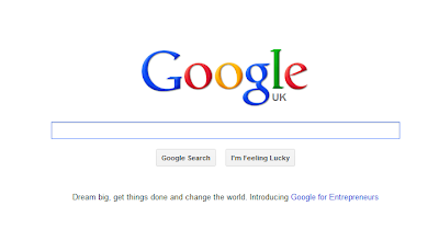
Google.com is an example of good web design. A simple colour palette and layout does not distract the user from any information on the website. A good design should avoid being fashionable, this way the design never feels antiquated. Googles logo has changed very little since the company began, the same goes for the layout of the website, not much has changed since it all began. Googles logo is timeless which is why it has stayed the same for all this time, similarly coca-cola is another a great example of good logo design it too has changed very little over the years.
 |
| Google from 1998 |
 |
| Google from 2012 |
Google.com is a website that we are all very familiar with and will most probably use every day. However, even if someone isn't familiar with google it's unlikely they would have any problems using it. All the information on the website is no more than 2 clicks away.
| Accessing features other than the search engine are displayed at the top of the page. |
If you have an account set up with google, it can be easily accessed from the google homepage allowing you to view your profile.
Google is one of the best pieces of design we use day to day. It's simple aesthetics and ease of use make it one of the best websites around and why it is an example of good design.
Bad Design - Al Yaqoub Tower, Dubai
Al Yaqoub Tower is a 60 storey replica of Big Ben currently under construction in Dubai, UAE and is a great example of how not to design a building. First of all the building is in terrible taste, it looks tacky and the fact that it is a rip off cheapens the whole design. Unlike Google's logo and webpage layout, the design of this building is far from timeless. This building looks bad now, imagine it in 20 years from now.
.JPG) |
Other Bad Designs:
Anything by Anish Kapoor, in particular, the ArcelorMittal Orbit built for the London olympics:
Also Olympic related, the London 2012 mascots:
 |
| They look like the weird offspring of Sauron and the Teletubbies. |


No comments:
Post a Comment